

How to Create a Pivot Table in Excel

Pivot tables are one of Excel's most powerful Microsoft tools. A pivot table allows you to extract the significant data and trends from a large, detailed data set. When analyzing your customer advocacy program data, pivot tables can be excellent tools for efficiently gathering insights on your customer advocates and advocacy assets.
For example, have you ever tried sorting through a spreadsheet with hundreds, or perhaps thousands of rows of data to determine an insight about your program? Perhaps you needed to calculate the number of customer advocates in your program for a specific product within a specific geographical region.
Without a pivot table, you may have spent precious time applying filters, separating segments of data into different worksheets, and applying various calculation functions to transform a general report from your reference management system into valuable insights about your advocacy program.
Pivot tables replace all that fuss with a simple process for analyzing your data. Follow along below for a quick crash course in streamlining your reporting with pivot tables.
For the following examples, we are using a dataset that has an Order ID #, product name, category (fruit or vegetable), amount, date, and country.
Insert a Pivot Table
To insert a pivot table, execute the following steps.

1. Click any single cell inside the data set.
2. On the "Insert" tab, in the "Tables" group, click "PivotTable".

The dialog box shown to the right appears. Excel automatically selects the data for you. The default location for a new pivot table is "New Worksheet".
3. Click OK.
Note: You should select the entire data in the sheet, so that if you add any additional data, you can refresh the pivot table to get updated.
Drag Fields
The "PivotTable Fields" pane appears, as shown in the image to the right. For the first example we want to find the total amount exported of each product, so we will drag the following fields to the different areas.

"Product" field to the "Rows" area: This will list each product in a separate row.
"Amount" field to the "Values" area: This field will default to “Sum”, which will sum the amount of each row. In our example, it is the sum of each product.
"Country" field to the "Filters" area: This allows us to filter the table to see the total amount of exported product for a specific country.
Below you can find the pivot table, which is automatically sorted A-Z based on the rows. That's how easy pivot tables can be!

Sort
If we want to see the products in order from largest amount to smallest, then we need to sort the pivot table.

Click any cell inside the "Sum of Amount" column.
Right click and click on "Sort".
Select "Sort Largest to Smallest".
Note: You can use the standard filter (triangle next to Row Labels) to only show the amounts of specific products.
Change Summary Calculation

By default, Excel summarizes your data by either summing or counting the items. To change the type of calculation that you want to use, execute the following steps.
1. Click any cell inside the "Sum of Amount" column.

2. Right click and click on "Value Field Settings".
3. Choose the type of calculation you want to use. For example, click "Count".
Pivot Chart
A pivot chart is the visual representation of a pivot table in Excel. Pivot charts and pivot tables are connected with each other. Follow the steps below to learn how to transform the pivot table below into a pivot chart.

Insert Pivot Chart
To insert a pivot chart, execute the following steps.
1. Click any cell inside the pivot table.

2. On the "PivotTable Analyze" tab, in the "Tools" group, click "PivotChart".

3. The "Insert Chart" dialog box shown to the right appears. Select the type of chart you would like to create and then click OK.

4. To add data labels to the chart, click on "Chart Elements" and check "Data Labels" to show the numbers above each bar.
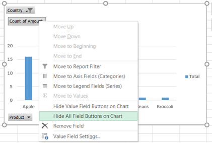
5. Right click on any Field and then select "Hide All Field Buttons on Chart" to hide all fields.
Note: Any changes you make to the pivot chart are immediately reflected in the pivot table and vice versa.
Work Smarter, Not Harder
There is a treasure trove of valuable insights about your customer advocacy program that can be uncovered with pivot tables. Whether you’re trying to gather more detailed information about the makeup of your advocacy program for a specific industry or working to determine the breakdown of your voice-of-the-customer assets by product, pivot tables can help you reach that golden nugget of information in a fraction of the time of other approaches.
Pivot tables can seem overwhelming but hopefully this guide has helped to get you started. Once you know how to use them, they are a great tool to have in your arsenal.
Curious if there’s a better way to analyze your program data? Contact us! We’d love to discuss reporting strategies with you.